
A patient's record in a clinician's pocket
- Company
- Thomson Reuters Healthcare
- My role
- Senior User Experience Designer
- Dates
- Jul 2010 to Jul 2014
- Platform
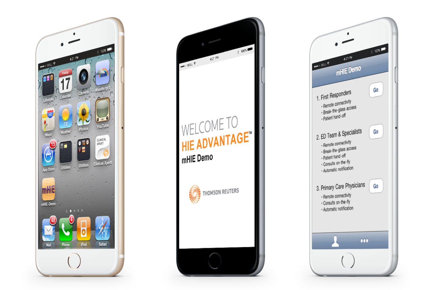
- iPhone apps for health information exchange (mHIE)
Process
Understand
Studied how clinicians and care teams needed patient information
Define
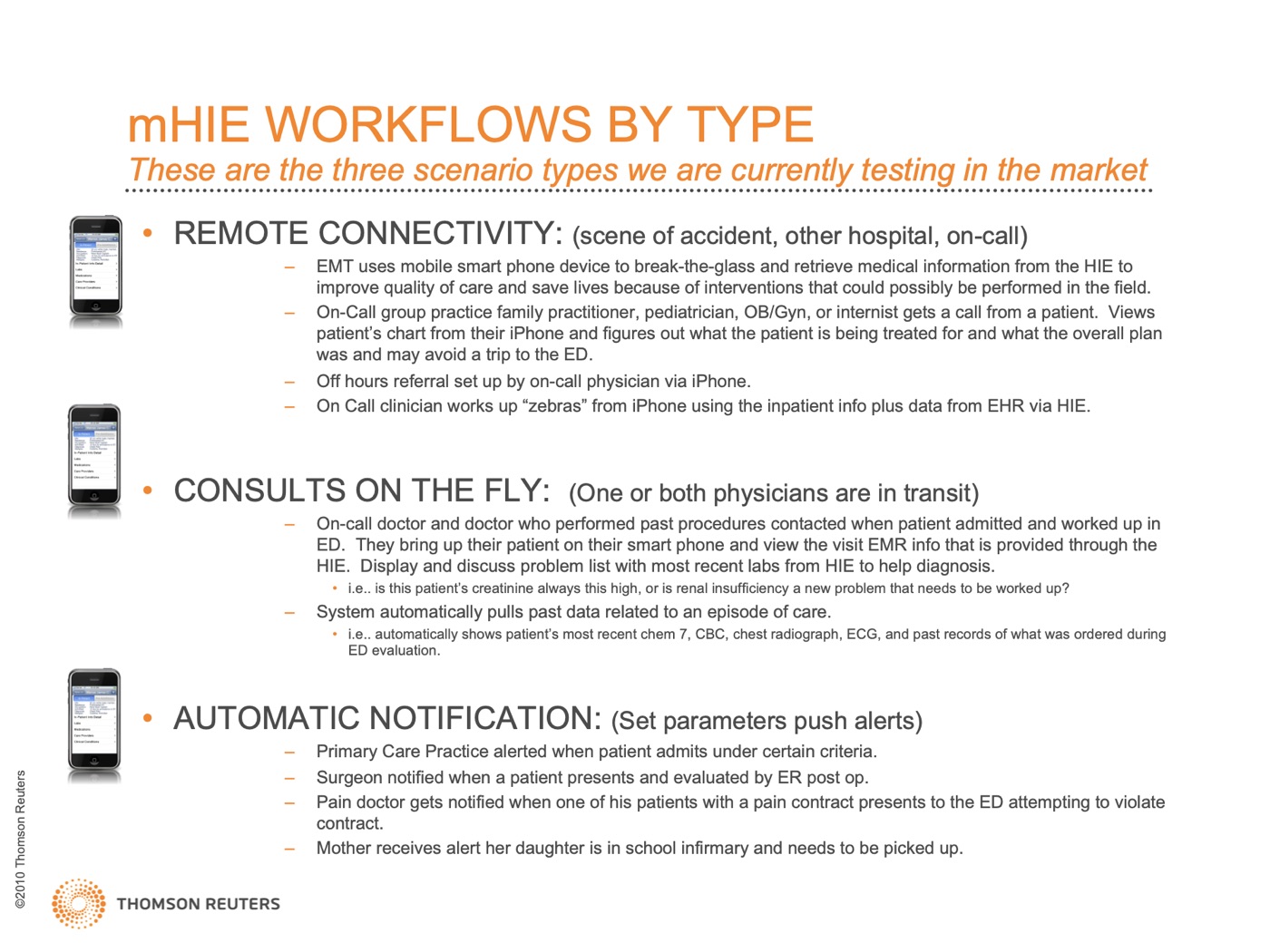
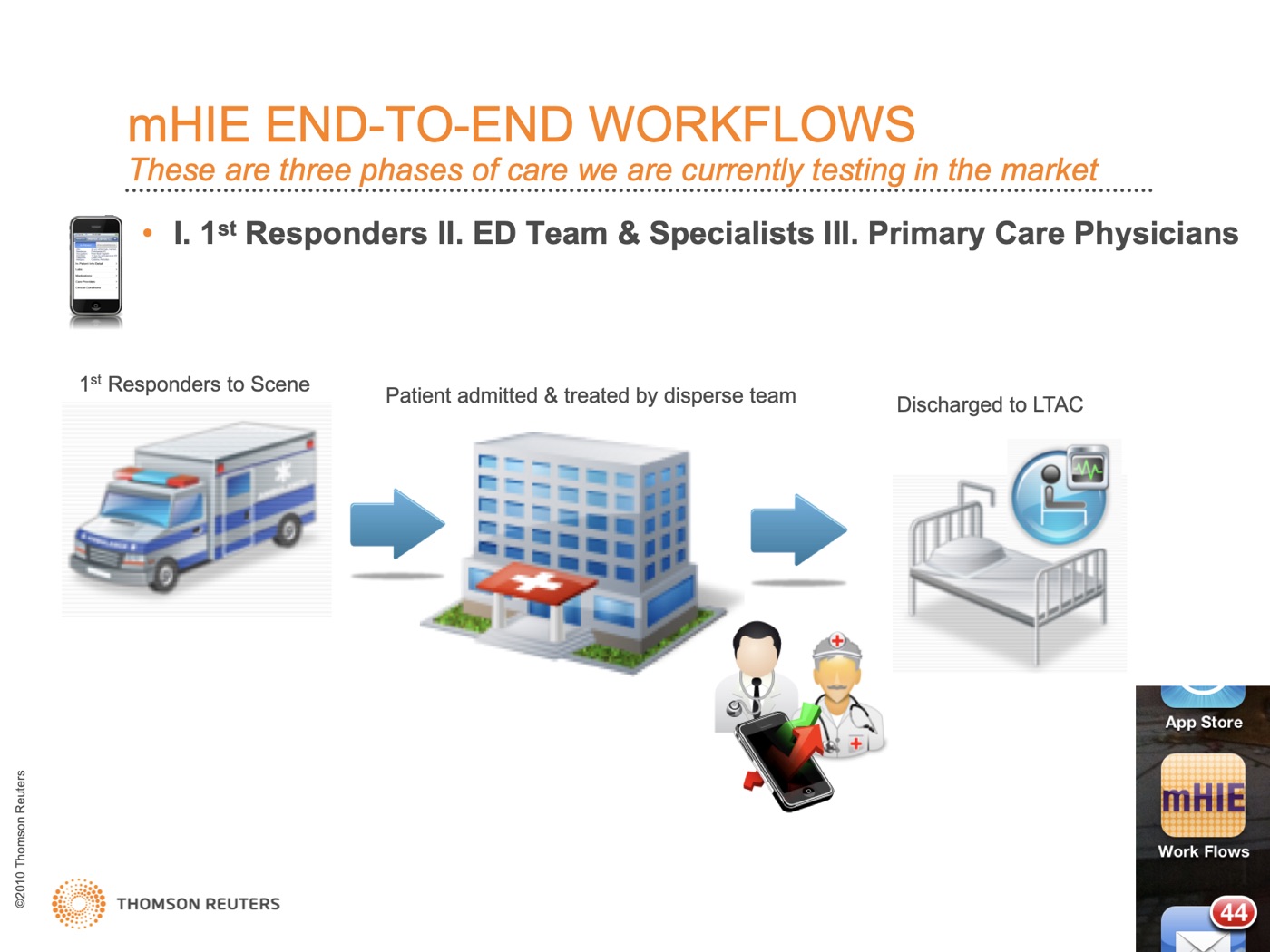
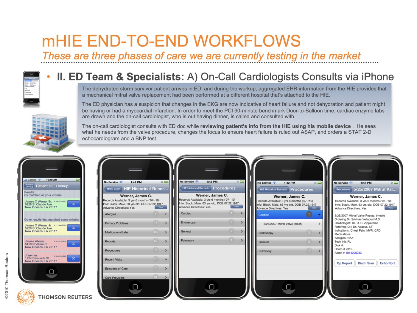
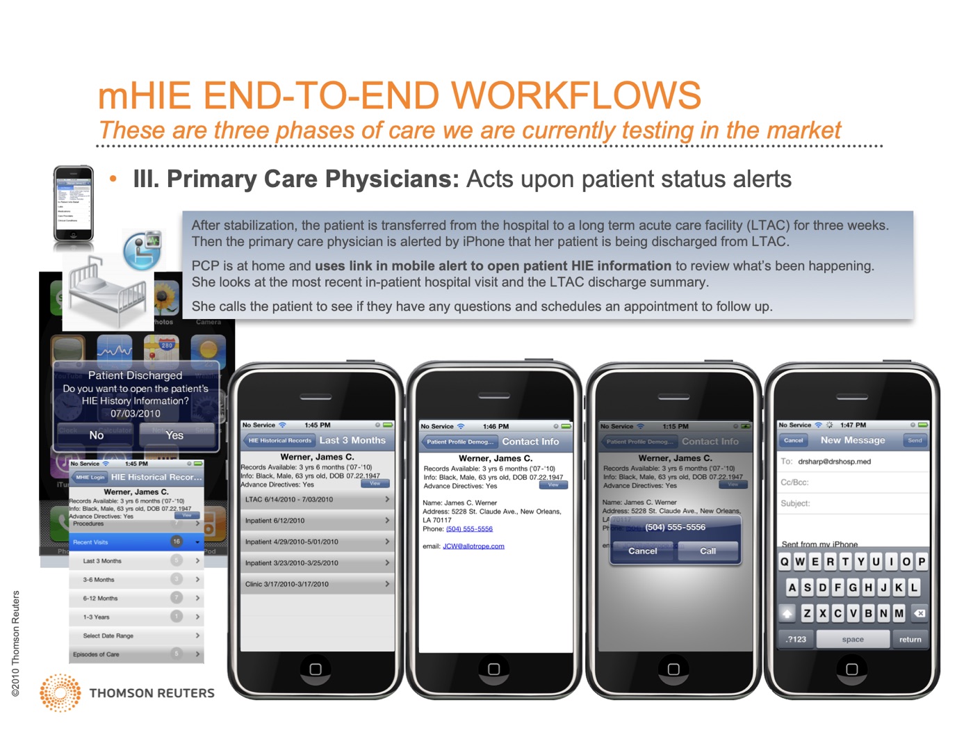
Wrote personas and workflow scenarios
Explore
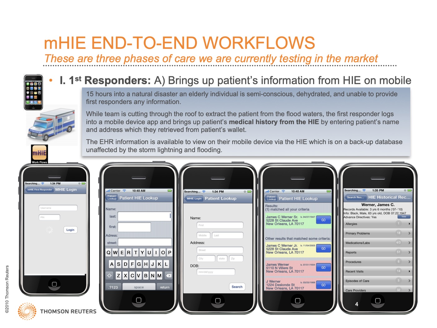
Designed proof-of-concept apps and an interactive demo
Build
Delivered designs for mHIE
Measure
Recommended holding mHIE as too early for the market; a white paper; a granted patent
The problem
Health information exchanges were starting to let providers share patient records, but the information sat on desktop systems, away from the clinician at the bedside or on the move.
My role
I designed the iPhone apps for Thomson Reuters' mobile health information exchange. My personas and workflow scenarios became the basis of a published white paper.
Key decisions
Scenarios as the source of truth.
I wrote workflow scenarios for each type of clinician and care coordinator, and those scenarios shaped the product, the white paper and the patent.
Recommending not to launch yet.
On mHIE, usability testing showed that patient opt-in was a real barrier, and competing hospitals resisted sharing their patients' data with each other. Our project team recommended that mHIE was too early for the market. Years later the idea fizzled anyway, which likely saved the company millions it would have invested.
Outcome
A recommendation to wait, based on the usability and market evidence, plus a published white paper built on my UX scenarios and a granted patent from my designs (US20120296672A1, system and method for managing mobile HIE information).
Looking back
I'd like to know whether we were simply far ahead of our time: whether the opt-in and data-sharing barriers we saw have eased since.
Images

White paper
Mobile Health Information Exchange (February 2011), built on my UX scenarios.
From the mHIE workflow scenarios deck (Thomson Reuters, 2010). Patient data is made up for the demo.